Showing posts with label book traveling thursday. Show all posts

Thursday, October 12, 2017

Book Traveling Thursday: A New-To-You Author You Discovered This Year - Siddhartha Mukherjee!


Featured Image -- 266

x

This week I'm once again participating in Book Traveling Thursday!
"Book Traveling Thursdays is a weekly bookish meme hosted by Catia from The Girl Who Read Too Much and Danielle's Book Blog. The idea of this group is check out the list of weekly themes for each month in this meme's Goodreads page and simply pick a book to match the theme! Once you've found a book, explore different covers of various editions for that book and make a post about it.  To find out more, you can check out our Goodreads group!


This week's theme is: "A new to you author you discovered this year." I've discovered quite a few fantastic new-to-me authors this year, but only a few of them had multiple editions, so that helped me narrow it down to:
The Emperor of All Maladies by Siddhartha Mukherjee
Cancer is a very close beast to my family, as both of my parents have battled with various forms of it, so I knew that this would be a book I needed to read one day. I ended really loving this book! Not only was it incredibly informative and interesting, but it also approaches the subject in a sincere, very personal, and very accessible manner. This is definitely a must-read! I went on to read Mukherjee's The Gene after this one and was also impressed by his voice and ability to convey such intricate subject matters in such an accessible manner. Can't wait for more from Mukherjee!

Original Cover Design:
 The Emperor of All Maladies: A Biography of Cancer

Original hardcover edition, Scribner 2010
Other US Covers:

The Emperor of All Maladies: A Biography of Cancer    El emperador de todos los males: Una biografía del cáncer

Left: US Trade Paperback edition
Right: Spanish Kindle edition


Favorite Covers:

The Emperor of All Maladies: A Biography of Cancer     De keizer aller ziektes: Een biografie van kanker     Der König aller Krankheiten: Krebs - eine Biographie

Left: Original English edition
Middle: Dutch edition
Right: German edition

I really like the simplicity of most of these and how the only major imagery is the cancer symbol. I'm not sure why the Dutch decided to make the cover look aged, but I'm okay with it! It reminds me of how long a history cancer has and how it will only continue to plague us. 


Least Favorite Covers: 

إمبراطور الأمراض     L'imperatore del male. Una biografia del cancro

Left: Arabic edition
Right: Italian edition

I am really not digging the microscopic view of what I'm assuming is a cancer cell (??) in the Arabic one, and the Italian edition is just so lifeless. I like simplicity, but the crab is just so small and the text just doesn't stand out in any way. I'd definitely pass on these two. 
What do you think of these covers? Do you have a favorite? Who's a new-to-you author that you discovered this year?

Thursday, September 21, 2017

Book Traveling Thursdays: A Book Set Somewhere I Want to Visit - Greece and Egypt


Featured Image -- 266

x

This week I'm once again participating in Book Traveling Thursday!
"Book Traveling Thursdays is a weekly bookish meme hosted by Catia from The Girl Who Read Too Much and Danielle's Book Blog. The idea of this group is check out the list of weekly themes for each month in this meme's Goodreads page and simply pick a book to match the theme! Once you've found a book, explore different covers of various editions for that book and make a post about it.  To find out more, you can check out our Goodreads group!


This week's theme is: "Plan your next vacation. Feature a book is set in a location on your travel bucket list." I had a difficult time choosing for this one, so I decided to cheat a little and feature two different books:
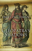
Cleopatra's Shadows by Emily Holleman - Setting: Egypt
and
Helen of Troy by Margaret George - Setting: Greece
I've been dying to visit both of these countries for years. There are so many things that I want to see in Greece, but in addition to that I just desperately want to visit the place that I studied intensely for four years of my life. To be in the same place where so many incredible historical figures lived... one day. I've also always wanted to visit Egypt! I've heard it is a really neat place to visit, not to mention the pyramids and other tombs I'd love to visit. I really hope to make it to both of these places.
(Review for Cleopatra's Shadows)
(Review for Helen of Troy)

Original Cover Design for Both:
 
Cleopatra's Shadows: Little, Brown and Company, 2015
Helen of Troy: Penguin Books, 2006
Other US Covers:

Helen of Troy
Cleopatra's Shadows


Favorite Covers:
It might be boring of me, but I think I'm just going to have to go with the original covers of these as my favorite:


Least Favorite Covers: 


The Italian edition of Cleopatra's Shadows isn't exactly a bad cover so much as I just don't think it fits the content of the book very well.
This Russian edition of Helen of Troy (right), however.... I'm just going to pass. It makes it look just a bit campy. 

What do you think of these covers? Do you have a favorite? Have you read these books?

Thursday, August 31, 2017

Book Traveling Thursday: A Book From A Favorite Author - Michel Faber!

Featured Image -- 266

x

This week I'm once again participating in Book Traveling Thursday!
"Book Traveling Thursdays is a weekly bookish meme hosted by Catia from The Girl Who Read Too Much and Danielle's Book Blog. The idea of this group is check out the list of weekly themes for each month in this meme's Goodreads page and simply pick a book to match the theme! Once you've found a book, explore different covers of various editions for that book and make a post about it.  To find out more, you can check out our Goodreads group!


This week's theme is a book by one of your favorite authors, so I chose:
Under the Skin by Michel Faber
I've loved all of the books by Faber that I've red so far, and he is easily one of my favorite authors. I decided to pick Under the Skin because this book is so incredibly weird that I wanted to see what other covers looked like.


Original Cover Design:
 Under the Skin
2000, Houghton Mifflin Harcourt
Other editions:

Under the SkinUnder the SkinSotto la pelle
Under the SkinSotto la pelleΚάτω από το δέρμα
Derinin AltındaIspod kožeDie Weltenwanderin

Top Row: Paperback, Kindle, Italian
Second Row: Paperback, Italian, Modern Greek
Third Row: Turkish, Serbian, German

I'm pretty intrigued by these various covers. I opted not to include most of the movie tie-in ones because, well, I think they're pretty bad (personally, the movie looks completely off from the book anyway, but that's another story). I think the ones that have roads on them are best for this book in particular, and I'm really not sure what's up with the German. All in all, I think these are all a pretty interesting variety!

What do you think of these covers? Do you have a favorite? Have you read this book?

Thursday, July 6, 2017

Book Traveling Thursdays: Favorite Book of the First Half of the Year

Featured Image -- 266

x

This week I'm once again participating in Book Traveling Thursday!
"Book Traveling Thursdays is a weekly bookish meme hosted by Catia from The Girl Who Read Too Much and Danielle's Book Blog. The idea of this group is check out the list of weekly themes for each month in this meme's Goodreads page and simply pick a book to match the theme! Once you've found a book, explore different covers of various editions for that book and make a post about it.  To find out more, you can check out our Goodreads group!


This week's theme is your favorite book of the year so far. For this one, I chose: 
The Eye of the World by Robert Jordan
Picking one book as my favorite of the year so far is incredibly difficult, but fortunately what saved me was the fact that most of the books I loved only had one or two different covers, so I simply chose my favorite that had the most international covers - The Eye of the World! I fell in love with this book so hard and I cannot wait to continue on in the series.

Original Cover Design:
 The Eye of the World (Wheel of Time, #1)
Other editions:

The Eye of the World (Wheel of Time, #1)The Eye of the World (Wheel of Time, #1)Die Suche nach dem Auge der Welt (Das Rad der Zeit, #1 - Das Original)
L'occhio del mondo (La Ruota del Tempo, #1)L'occhio del mondo (La Ruota del Tempo, #1)El ojo del mundo (La rueda del tiempo, #1)
Zenica sveta (Točak vremena, #1)Oко мира (The Wheel of Time, #1)L'Œil du Monde (La Roue du Temps, #1)
Top Row: Trade Paperback. Mass Market, German
Middle Row: Italian, Italian #2, Spanish
Bottom Row: Serbian, Russian, French

Honestly, there are so many international covers for these books, but I just went with a few random ones because I definitely couldn't add them all. I love how different and imaginative they all are, but I'm definitely partial to the original cover for its classic fantasy vibe.

What do you think of these covers? Do you have a favorite? What is your favorite book of 2017 so far? Let me know!


Thursday, June 29, 2017

Book Traveling Thursdays: A Book that Originally Had A Yellow Cover

Featured Image -- 266

x

This week I'm once again participating in Book Traveling Thursday!
"Book Traveling Thursdays is a weekly bookish meme hosted by Catia from The Girl Who Read Too Much and Danielle's Book Blog. The idea of this group is check out the list of weekly themes for each month in this meme's Goodreads page and simply pick a book to match the theme! Once you've found a book, explore different covers of various editions for that book and make a post about it.  To find out more, you can check out our Goodreads group!


This week's theme is a book that was originally published with a yellow cover. For this one, I chose: 
Slade House by David Mitchell
I loved this book! It was everything I want in a dark, twisty house story, and I definitely recommend it to anyone interested in that sort of thing. My review for Slade House can be found here!


Original Cover Design:
 Slade House
Other editions:

Slade HouseSlade HouseSlade HouseDoorgang
I custodi di Slade HouseDům za zdíSlade HouseSleido namas
Top Row: Trade Paperback. UK, UK, Dutch
Bottom Row: Italian, Czech, Polish, Lithuanian

Although the original yellow cover is my favorite, I really love the trade paperback, second UK, and Polish editions! I think they are wildly imaginative and definitely contribute to the atmosphere of the story. The Polish one really makes the house seem like a land of its own - which it sort of very much is.  The Dutch cover is also a good choice to me because the house is so intimidating and imposing, but it gives off more of an old-school haunted house vibe, which isn't completely right in my opinion. 
What do you think of these covers? Do you have a favorite? Do you have any books that you have a bad cover but are fantastic stories, regardless? Let me know!


Thursday, June 15, 2017

Book Traveling Thursdays: The Inside is What Matters - A Favorite Book With a Not-So-Pleasing Cover

Featured Image -- 266

x

This week I'm once again participating in Book Traveling Thursday!
"Book Traveling Thursdays is a weekly bookish meme hosted by Catia from The Girl Who Read Too Much and Danielle's Book Blog. The idea of this group is check out the list of weekly themes for each month in this meme's Goodreads page and simply pick a book to match the theme! Once you've found a book, explore different covers of various editions for that book and make a post about it.  To find out more, you can check out our Goodreads group!


This week's theme is: 'The inside is what matters... choose a book with an 'ugly' cover but that is beautiful on the inside.'
Kushiel's Dart by Jacqueline Carey

It's not necessarily that I think this cover is 'ugly' so much as I feel like it doesn't convey nearly enough about how fantastic this story is. This cover, to me, gives up off odd cliche romance vibes, which it absolutely is not. (Review found here!)
Original Cover Design:
 Kushiel's Dart (Phèdre's Trilogy, #1)
Other editions:

Kushiel's Dart (Phèdre's Trilogy, #1)Kushiel's Dart (Kushiel's Legacy)La Marque (Phèdre's Trilogy, #1)La Marque (Phèdre's Trilogy, #1)
Kushielova strijelaDas Zeichen (Phèdre's Trilogy, #1)Kushiel's Dart (SFBC 60th Anniversary Collection)Kushiel's Dart (Phèdre's Trilogy, #1)
Top Row: Kindle Version, Trade Paperback, French Hardcover, French Paperback
Bottom Row: Croatian, German, Anniversary Edition, Special Limited Edition

I personally love the gorgeous limited edition one in the bottom right! They aren't available anymore (excpet on Ebay for >$200), but I would still love to own one. I think the German one screams 'BDSM romance' way too much, and does anyone else think the top right French edition looks like Little Red Riding Hood? I do like the anniversary edition one on the bottom room as well!

What do you think of these covers? Do you have a favorite? Do you have any books that you have a bad cover but are fantastic stories, regardless? Let me know!